It's time for another trip around Grandma Verdie's antique table... I've made this my "go-to girl" for seasonal or holiday-themed displays. So far we've seen a Spring tablescape, a bit of Christmas sparkle, and the clean, crisp look of blue and white for the new year. Now that Valentine's Day is on its way, I thought I would change it up again with pink and ivory. Here's the new look for the next month or so:
It all starts with this lovely new tablecloth acquired via Ebay. It wasn't the best bargain I've ever found, but I did get it for my "best offer" price which was quite a bit lower than the asking price. I'd have been happier if they'd accepted my first offer, but it's very pretty and I'm not complaining - I really love it!
Of course, Mr. Duck remains on the table, perched again on a small stack of seasonal Victoria and Romantic Homes magazines. The deep red glass heart is a paperweight - a gift from long ago.
This pink glass candy dish, a flea market find with a pretty grape-and-leaf pattern, is awaiting some Hershey's Kisses.
This pretty bowl, filled with silk carnations, came from my mother-in-law Betty. Just look at thoseheart-shaped cut-outs, and flirty gold-edged tab handles!
And finally, truly a favorite thrifted find... a Cupid-themed tic tac toe game!
What's neat about this piece, besides the overall look and weight of it, is how I acquired it: I found a bag containing just the pieces at my local Goodwill one day. They were so pretty I had to have them, even though, at the time, I could only guess at their purpose.
Then several weeks later, on my next trip back to that same store, I found the game board. My guess had been correct, but obviously the elements had gotten separated at some point and I was lucky enough to spot them both!
A bit later, just for fun, I added a soft stuffed heart which you can see in the background... but also wanted to capture a shot of the late afternoon sun streaking across the table.
Also just for fun, a couple of filters applied through the "BeFunky" app on my iPhone. I find these little game pieces quite fascinating!
I really enjoy doing little vignettes on this table - it gives me a chance to play with my stuff! LOL How about you - do you have a favorite spot for displays like this?
I'll be joining Marty over at A Stroll Through Life for her fabulous Tabletop Tuesday party! Hope you will click through and visit all the pretty displays linked there!
Okay so... did you watch the Super Bowl? We're not huge athletic supporters in our house, but we did have the game on... certainly the Ravens' 109-yard kick-off return at the start of the second half was exciting to watch, but moments later when the stadium lights went out, I swear this is all I could think of:
Who... or WHAT-ever was behind the power outage, it definitely affected the Ravens' mojo! And that, folks is the extent of my expert football commentary.
Oh! And for the record, here are my picks for best commercials:
In third place, "Viva Young" by Taco Bell:
Second Place, "Man vs. Cheetah" by Skechers:
And my favorite,"Prom" by Audi America:
Of course, you can't have a Superbowl without a Budweiser Clydesdale commercial, and this year's spot was so sweet:
Almost five years ago, we moved into our present home. It was a rather horrid mixture of busted walls, dog-pee carpets, and other peoples' smells. So, painting the entire thing was in order. But I have to admit, after five years, I just never fell in love with the color I chose for the 3rd and smallest bedroom - the room I commandeered as my dressing and craft room, a.k.a. the "Mom Cave." It was kind of a peachy color... not as orange as "tangerine" but not pink.
I tried for a long time to force it into becoming my little cottagey retreat room, but this year I finally gave up. It just wasn't working.
These two "before" pictures are a few years old but they are pretty accurate as far as showing the wall color. It's pretty, but I didn't love it:
So I decided recently to do a make-over in the Mom-cave - mostly just changing the paint color, but also a few small projects that would help achieve the garden style I wanted for the room. The challenge was, I had built a large glass-top desk in the room and there is really no way remove it completely - it's just too big. Plus, I didn't want to have to empty the barrister bookcase of all its contents. So, over the course of a week, I spent my evenings shoving the furniture around into various corners of the room (like a heavy game of Tetris!) while I taped then painted the walls one at a time. Here's a glimpse of what the mess of that method looked like:
And here, just for fun, are shots of my original gallery walls. You can see they're kind of a hodge-podge:
My new color is a soft botanical green. You can see the difference here:
For each wall, I of course started by removing all the picture-hanging hardware and patching the holes. I taped off any wood trim, did the cutting in with a brush, then "filled in" with the roller. It took two coats. Here's a good representation of the new color:
And here is my helper:
My secondary goal in the room, next to painting, was to simplify just a bit. To cull a few of my collected items, and make room for items that I really liked but had in storage. That meant the gallery walls were ultimately going to look a little different. They are still a work in progress, but here are some after shots of the finished space. (You might see my other helper lurking on chairs or other flat surfaces.)
I am truly in love with this color. It's my intention to use an off-white/ivory as the accent color, although a few items in the room are already bright white so they'll probably stay that way.
I'll share the before-and-afters of a couple additional small project here in future posts, but here's a hint: there were two objects in the room that really needed a little "shabbifying." Here they are:
You'll see more of those soon! This re-paint was a pretty big project for me and I really love the way it turned out! How about you - have you done any painting lately? Did your color choices turn out the way you wanted?
I'm linking my re-painted Mom Cave to Jill's A Round Tuit party! Be sure to click through for SO much beautiful inspiration!
This little project is actually not finished. But I love it so much, I just have to share it!
In 2008, our home on Des Moines' north side was destroyed in flooding. The city purchased the house and property from us shortly afterwards, and demolished it. In the few years since, we've occasionally driven past the site. Sometimes, we get out of the car and walk around - I'm not entirely sure why, but it seems to bring a little comfort at times when we get to reminiscing about the loss.
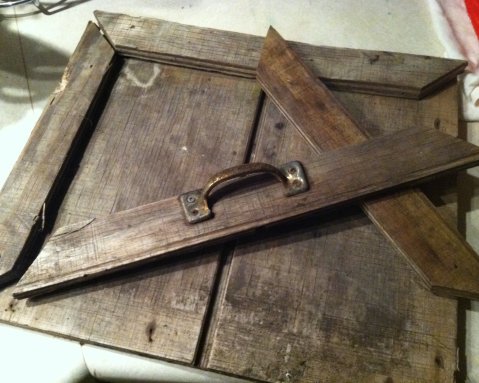
On one such visit, we noted that someone had dumped a truckload of junk in our old backyard. This little cupboard door was calling my name, and I plucked it from the middle of the pile to study it.
I absolutely love the worn texture - it reminds me of linen fabric or linen-finish paper.
I knew for sure I wanted to make some sort of picture frame, but I didn't have any particular shots in mind when I first picked the little door out of the junk pile. It wasn't until we saw Stephanie's beautiful senior pictures (taken by Des Moines photographer Randy Shebek) that I knew I had just the right images to complement this frame.
Mr. Piglet helped me repair the cupboard door - I nailed the frame pieces back together and he glued and clamped them to make sure they would stay in place. He dug through his own stash to find a couple of nails that looked appropriately weathered - "You don't want new nails in there, they'll look out of place," he said. (I LOVE that he had the same vision for this project!)
Once it was all dry, I selected two 5x7 pictures - one with a very distinctive natural element, the stone, to complement the textured wood, and one with some color in the background to draw attention.
I added a piece of vintage lace in one corner as a background element, and created depth by stacking two pieces of foam core board, smaller than the right-hand photograph, and attaching that photo to the "riser" created by the foam core. Note the shadow cast by the "raised" picture, in the photo below.
To finish, I am on the hunt for a used Scrabble game so I can spell out either Steph's name or a word or two to describe her with the tiles. And I'm still thinking about what, if anything, belongs in that lower left corner. I'll post a follow up when I finally get it complete, but it's already one of my new favorite pieces in the house because it uses three of my favorite elements: weathered junk, bits of vintage finery, and my amazing daughter!
Just sharing a couple of sewing projects I completed this week... I have a third but I think it needs a little something more so I don't consider it finished yet. More on that one soon!
First up is this soft, cuddly sweater pillow that I attempted to whip up one night this week, and ended up running my finger through the sewing machine - OUCH!!
Turns out, trying to stitch over this bulky knit is harder than one thinks it's going to be: the "tines" of my presser foot kept getting hooked in the knit, so I had to run my fingers very close to the needle to keep the knit pressed down so the foot would run smoothly. And in the process, ended up getting my finger directly under the needle. In and out, all the way through, one time.
A little cold water, a little peroxide, a little pressure... and all is better. As for the pillow - well it's not quite square but it's cute nonetheless, and super-soft.
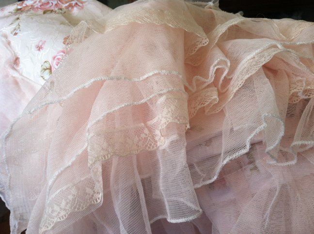
The second project is a sweet floral "cozy" that I made from a finished standard pillow sham, to fit over the scanner/printer that sits on my work table in the mom-cave. I mean, let's face it: a shiny black plastic printer just doesn't look "shabby," or cottagey, or romantic at all.
I had a reversible cozy I'd made many years ago for a desktop copier, but it wasn't quite the right size. This pretty sham from Mainstays - a thrifting find at 99 cents - was perfect for this project. I didn't even deconstruct it; I just boxed the corners of the finished sham and called it good.
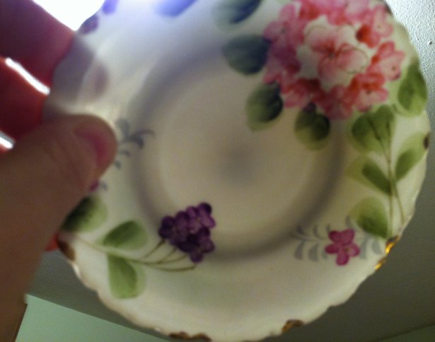
I've been on a mission to re-do the "Mom-cave" this past week - I do have a few remaining small projects, but one of the things I came across while cleaning/organizing was a set of five of these sweet little saucers. Two of the five were displayed in my grandmother's home for many decades - I'm not sure when she acquired them - and the remainder were in storage there. Two of them have some fairly noticeable flaws, and I'm now happily displaying three of them on my little restyled knick-knack shelf.
Based on the backstamp, I learned that they were a product of the Te-Oh China Company in Japan, and are examples of hand-painted Nippon ware produced between 1891-1921.
"Nippon" is (or was) the Japanese pronunciation of that country's name. Beginning in 1891 the US's McKinley Tariff Act required that all imported products bear the name of the country of origin. So, the word "Nippon" appeared on pieces imported from Japan beginning that year. Then, in 1921, the rules were amended to state that the name of the country of origin must be stated in English. Because the name Nippon was determined to be a Japanese word, its use was dis-allowed so imports after 1921 were marked "Japan" or "made in Japan."
Along with the Te-Oh backstamp (which was a fairly common mark found on Nippon pieces), the translucence of these tiny plates is another indicator that they are delicate, authentic Nippon.
So is the use of gold edging and the raised dots and lines on parts of the design, although much real Nippon is actually more elaborate in design.
I am so happy to be displaying these delicate saucers - and am amazed that they could be anywhere from 92 to 122 years old!
I'm sharing my pretty Nippon saucers at Suzanne's fabulous link party, Vintage Thingie Thursday!